Design your first email template
A step-by-step guide to the Azimea email designer, with real screenshots and a complete example.
email editor guide · email template tutorial · email designer · template walkthrough
An email template is a reusable design for a campaign or an email step in a flow. Saving a template does not send an email.
This guide builds a seasonal product email for a fictional business, Example Company. The screenshots use the English interface and English example content. Your dashboard can display controls in another selected language.
The result we will build
Section titled “The result we will build”| Part | Example |
|---|---|
| Template name | Autumn collection |
| Subject | Discover the autumn collection |
| Preview text | New styles and ideas for every day. |
| Main image | A product photograph with descriptive alternative text |
| Heading | Discover the autumn collection |
| Body | Comfortable pieces for days on the move. Explore the new arrivals and choose your favourites. |
| Button | View the offer, linked to the exact collection page |
Use your own facts, brand assets and destination URL. The sample product and URL in the screenshots are illustrative.
1. Start a template
Section titled “1. Start a template”Open Email templates. Choose Use on a ready-made model or New template for a blank email. A model creates an editable copy in My templates. For this example, choose a seasonal model under Offers & promotions and give the copy a name you will recognise later.
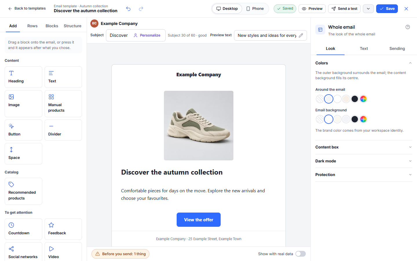
The designer has four areas: the top bar for preview and saving, the inbox line for subject and preview text, the left panel for adding content and arranging rows, and the right panel for the selected element’s settings. Click an element in the centre to edit it.
Templates open on a dedicated editor page. The top bar stays in place while the email canvas and settings panels scroll independently. On smaller screens, use Add and Edit to open the compact panels; scroll inside a panel to reach its remaining settings. Use Back to templates to return to the library. Pending changes are saved before leaving; if saving fails, stay in the editor and retry.
Text and Heading share a Text size preset list with an exact Size field beside it. Font menus include an Aa preview. For borders and rounding, use Each side and Each corner when the edges should differ; the component reference explains the controls and inline validation. The same reference covers header arrangements and generating a row background with AI.
2. Set the inbox details
Section titled “2. Set the inbox details”Edit the Subject and Preview text fields directly above the canvas. Enter a short subject and preview text that adds information instead of repeating the subject. Check the sender shown above these fields; configure your sending domain and sender before a real campaign.
For the example, use “Discover the autumn collection” as the subject and “New styles and ideas for every day” as the preview. If you insert a personalisation field, use Show with real data and check a contact whose optional fields are empty.
3. Build the layout
Section titled “3. Build the layout”Use the tabs in the left panel:
| Tab | What it is for |
|---|---|
| Add | Add a heading, text, image, button or another content block. Click a tile or drag it to a position in the email. |
| Rows | Add a ready-made row or choose a column layout. Use columns when the content benefits from being side by side. |
| Blocks | Reuse a block or row you saved earlier, such as a consistent header or signature. |
| Structure | Jump to a row, column or block in a longer email. Rename elements so the structure remains easy to scan. |
Click a row to change its number of columns, vertical alignment and lock setting. In Style, set the row background, padding, gap and border. Click a column to adjust its width, alignment, background and spacing. During a drag, the rounded blue Drop here marker shows where a block or row will land. Press Escape to cancel the move.
For a first email, a single column is enough: logo or brand name, one image, one heading, a short paragraph, one button and the footer.
4. Add the image and write the message
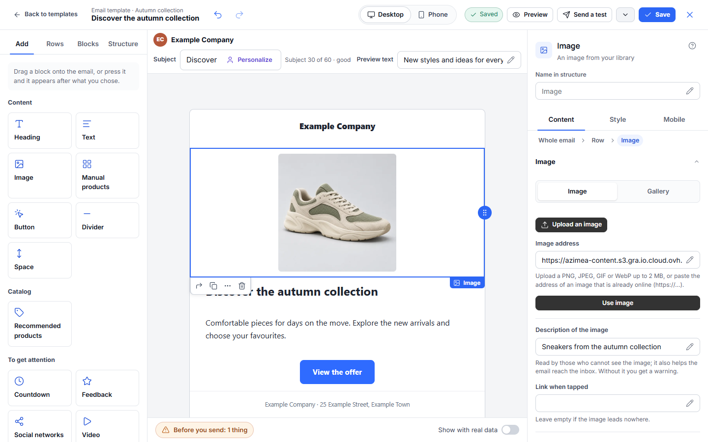
Section titled “4. Add the image and write the message”Select an Image block. In the right panel, choose Upload, select an image from Gallery, or enter an image URL you control. Add alternative text that describes the useful content of the image. If the image should be clickable, set its link deliberately; otherwise leave it unlinked. The Style tab controls its size, alignment, corners, border and spacing. Mobile controls phone-specific behaviour.
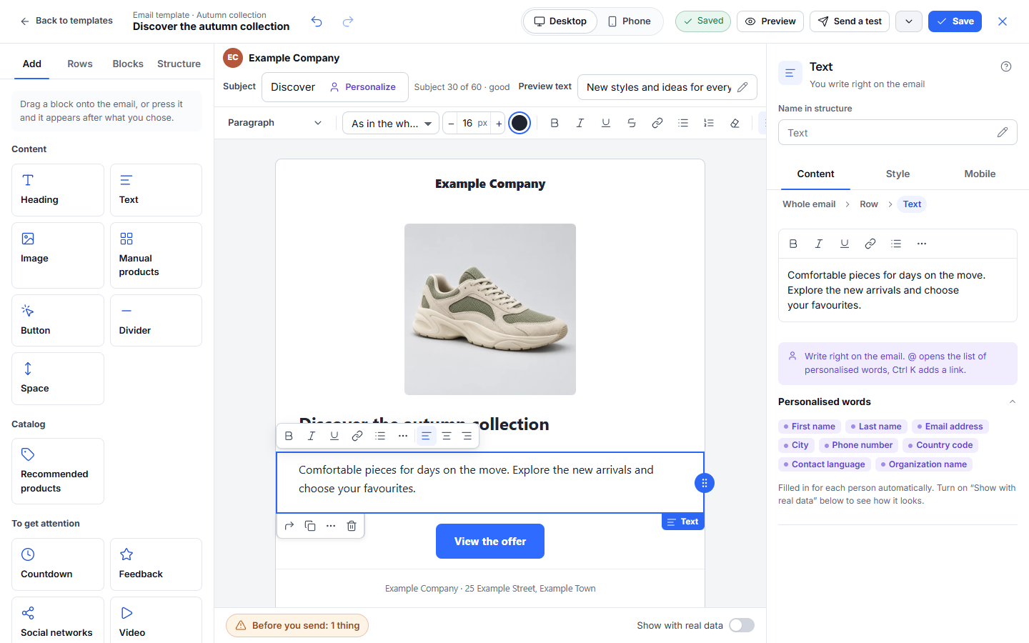
Click a Heading or Text block and write directly in the email. The toolbar above the canvas provides heading levels, a searchable font list, font size with minus/plus controls, text colour, emphasis, strikethrough, links, numbered and bulleted lists, alignment, line height and personalisation. Select text before applying inline formatting; use Clear formatting to remove inline styling. The right panel holds Content, Style and Mobile settings for the selected text block. Use Style for typography and spacing across the whole block. Valid setting changes appear in the canvas as you edit.
Select the Button block. Give it an action label such as “View the offer”, then set the exact destination URL. Open the destination yourself to check it. In Style, adjust the button’s colour, typography, shape, alignment and spacing. The message must still make sense if the recipient’s email app does not load images.
5. Check the whole email
Section titled “5. Check the whole email”Click outside a block or choose Whole email in the right panel. Look controls the outer and content backgrounds, width, corners and protection. Both backgrounds can be transparent. Text controls default typography and link colours. Sending contains the plain-text version and link-tagging settings where available. Keep enough contrast between text and its background.
Use other blocks when they serve the message:
| Block | Typical use |
|---|---|
| Divider / Spacer | Separate groups of content or add breathing room. |
| Selected products / Recommendations | Present a small, relevant product set. Review each product’s image, text, price and link. |
| Countdown | Show a real deadline; check what appears after it expires. |
| Feedback | Add a rating or satisfaction scale linked to a URL or published page flow. Put any question in a separate Text block. |
| Social / Video | Link to your channels or a video landing page. |
| HTML | Add custom markup when the standard blocks cannot express the content. Test it in email clients. |
| Brand / Legal footer | Identify the sender and provide the required footer information. Check the final footer in the campaign or flow. |
6. Preview, test and save
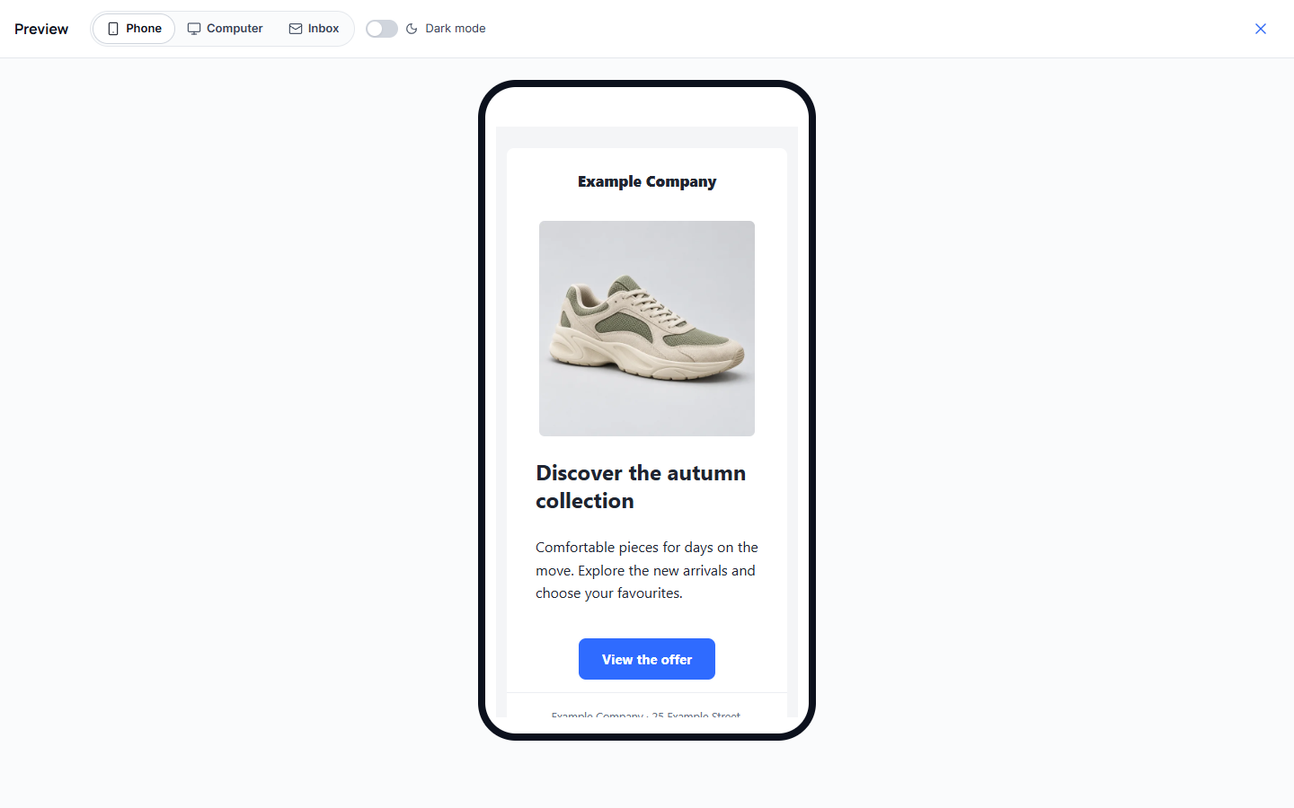
Section titled “6. Preview, test and save”Select Preview in the top bar. Switch between Phone, Computer and Inbox; also check dark mode. The phone view below shows the example’s image and content in reading order; scroll inside it to review the full email.
Stacked columns use the available phone width, in the normal or reversed order selected for the row. A row set to keep columns side by side retains that arrangement on phones, so check that its content remains readable. For a button in a narrow column, review the whole label: reducing unnecessary column padding and gaps can avoid cramped wrapping without changing the wording. Check the saved email in Preview as well as on the editing canvas. Button labels can wrap inside their available width, including a long word that has no spaces. In a narrow space, the button reduces its preset horizontal inset to leave more room for its label. The designer keeps the complete wording, link and chosen text size. If the result is too tall, give it more room or revise the layout, then check a test email in the clients your audience uses.
Resolve the warnings shown at the bottom of the designer. Check every link and image, then use Send a test to inspect a real inbox. A test email is a separate action; saving alone does not send anything. Wait for the Saved state, then select Save or close the editor. Find the result under My templates.
When you add the template to a campaign or flow, review that copy again. Updating the source template does not automatically replace content already copied into an existing campaign or published flow. Check the audience and consent before sending to contacts.
Starting with AI Studio
Section titled “Starting with AI Studio”You can describe the email or attach a visual idea in AI Studio, review the generated draft and then refine it in this designer. The same checks apply: facts, images, links, personalisation, phone preview and a test send.