Email component reference
Quick starts and focused guidance for every block and layout panel in the email designer.
Select a block in the canvas or the left-hand list to open its settings. The help icon beside the selected component’s title opens this reference at the relevant section, without closing the editor.
For most blocks, start with Content, use Style for appearance and spacing, then check Mobile and the phone preview. The whole email has Look, Text and Sending tabs; Custom HTML has only Content. Only the first settings section starts expanded; open the others as needed. Available controls depend on the selected component. For a complete worked example, see Design your first email template.
Borders, corners and input feedback
Section titled “Borders, corners and input feedback”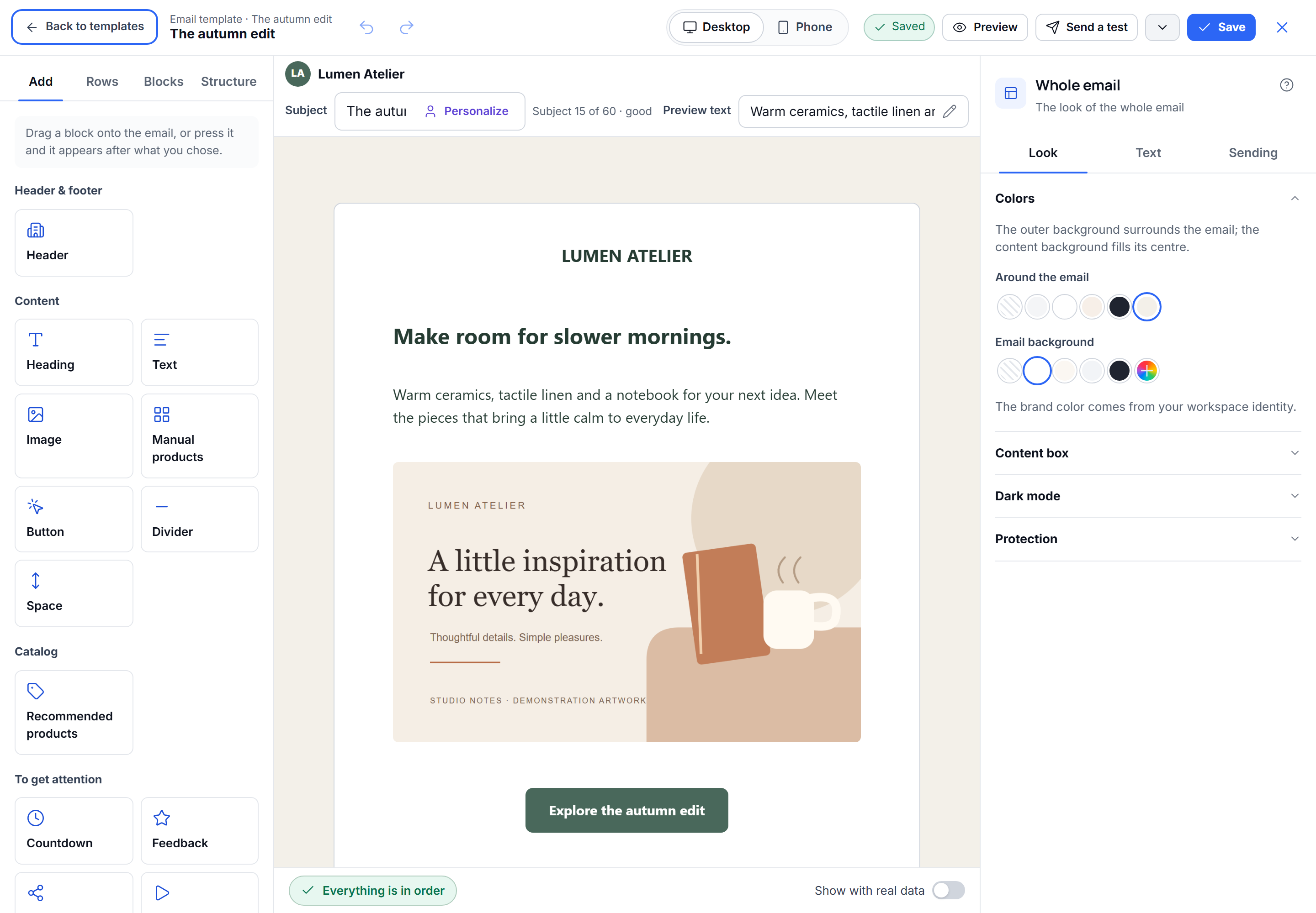
Where a component offers Border, choose Solid, Dashed, Dotted or Double. Leave Each side off for one shared width, or turn it on to set Top, Right, Bottom and Left separately. A width of 0 removes that side. Each corner similarly separates the four corner radii; turn it off to return to one shared radius. Rows and columns use these same controls. A single column still fills its row: the compact controls in the sidebar do not reduce its actual width.
Invalid numbers stay visible with their allowed range underneath; correct the value before continuing. The document keeps the last valid numeric value. Address and required-field errors appear below their field while typing. Preview the result after correcting them. Email-client support differs: Outlook’s classic Windows renderer can show square corners, and custom button borders use the HTML button rather than its uniform rounded VML shape.
Whole email
Section titled “Whole email”Quick start: keep the standard 600 px width, choose an outer background and a content background, then add rows.
The outer background surrounds the email. The content background fills the central email body; both can be transparent. Width presets are 520, 600 and 700 px; choose Custom for an exact width or corner value. Saved custom values are shown automatically. Text sets global heading/body fonts and text/link colours. Protection is in Look; the plain-text version and link tagging are in Sending where available. Whole-email settings establish the canvas, while rows, columns and blocks can have their own appearance. Review phone preview after changing the layout.
The whole email’s Content box section also sets padding inside the email, either together or separately for the four sides (0–120 px each). It defaults to zero and adds to the spacing on individual rows and blocks. The content box keeps its chosen outer width; padding reduces the room available to its rows. Check phone preview when using larger values.
Quick start: choose a ready-made column layout, then add a block to each column.
A row groups columns horizontally. Select a column to edit its own content area; select the row for the overall arrangement. Row background and content background affect different areas. Background images are optional. In Style, open Background to upload one, enter its HTTPS address or choose Generate with AI when available. Review the generated image before saving it as the row background; generation uses the same credit rules as image blocks. Choose a layout or set its column count, then use Column details for per-column adjustments. The column’s Hide on phone control follows Border. On phones, check whether columns stack, reverse their stack order or stay side by side. Use side-by-side only when the content remains readable.
Columns
Section titled “Columns”Quick start: select a column in an existing row, add its content, then adjust spacing only if needed.
The Content tab shows the containing row’s layout controls. Style and Mobile apply to the selected column. Column spacing and background sit inside the row; block spacing applies inside that column. If a change seems to affect the wrong area, check the selection breadcrumb before adjusting more values.
Heading
Section titled “Heading”Quick start: replace the heading text and choose a heading size preset.
Use a heading for a short title or section label. Text can be edited in the canvas or in Content, with personalisation where available. Style includes typography, alignment, colour and spacing. Inline formatting applies to selected text; block settings apply to the heading as a whole. Check long personalised titles in preview.
Quick start: replace the text, add links where needed and keep the default paragraph styling.
Use separate Text blocks for introductions, explanations and questions above a Feedback block. The rich-text controls and inline toolbar edit the same content; select the text you want to format. Block Style settings apply to the whole block. Text size offers common sizes from 12 to 96 px, including the email’s heading/body presets; Size beside it always accepts an exact value from 8 to 96 px. Line height is in the same Text section. Heading and brand text share these typography controls. Font menus show an Aa specimen beside each font, loaded from the application’s own font assets. Choose email-safe fonts when consistent display across clients matters; other fonts can fall back to an installed font.
Quick start: upload an image or select one from the gallery, then add meaningful alternative text.
You can also use an image URL or create an image with AI when those services are available. AI generation and keeping the generated image are separate steps. Selecting a gallery image returns to a compact image summary. Change image opens the chooser again. When entering a URL, use Use image to return to the summary; alternative text and destination stay in the first section. Add a destination only when the image should be clickable. Use Style for width, corners and alignment. Preview with images hidden to check whether the alternative text communicates the essential information.
Gallery items whose image cannot load disappear from the choices for that visit. This does not delete the saved asset record. If an image was removed from storage, upload an available replacement.
Button
Section titled “Button”Quick start: write a clear action such as “View offer”, then set its destination.
The label and destination are together in the first section. The label tells the reader what will happen; the URL determines where the click goes. Personalisation tokens may be available in both. Style offers Primary and Secondary visual starting points, followed by colour, width, alignment, corners and spacing. Applying a visual preset preserves the label and destination. A full-width button can help on small screens. Always test the destination in a test email, especially when it contains tokens.
If Your website is selected but the workspace has no website address, use Open website settings. Settings open in another tab. After saving the website, return to the editor: it checks the setting again automatically. Check again provides a manual retry if the setting or network has not caught up. The button keeps its workspace website token, so future website changes do not require editing each button.
Event products
Section titled “Event products”Quick start: use this block in an email whose triggering event supplies the products you want to show.
This is different from choosing products manually: the final product data comes from the event used for the message. Choose the layout and whether to show the total. Preview with a representative event before sending; an editor placeholder does not prove that a campaign or event contains the required product data. For hand-picked products, use Selected products instead.
Selected products
Section titled “Selected products”Quick start: enter the products you want to feature and choose one, two or three columns.
This block keeps manually entered product details in the email. Compact cards open a product-editing dialog. Review names, prices, pictures and destinations. Removing an item removes it from this email; this block does not edit your catalogue. For a selection of actual catalogue entries, use the manual-selection strategy in Recommendations instead.
Recommendations
Section titled “Recommendations”Quick start: choose a strategy, set the number of products, then preview with suitable catalogue and recipient data.
Recommendations use catalogue data rather than the triggering event’s product list. The panel offers strategies, optional category filtering and a manual selection where applicable. Only configure fields relevant to the chosen strategy. A strategy can return different products depending on available data; test the resulting email rather than assuming the editor’s sample will be the final selection.
Divider
Section titled “Divider”Quick start: add the divider, open Style, then choose a solid, dashed or dotted line.
The divider has Style and Mobile tabs. Style groups the line style, colour, thickness and spacing together. Changes appear in the canvas as you edit. Use Mobile to hide the divider on phones when needed, then check the phone preview. Use a Spacer instead when you want empty space without a visible line.
Spacer
Section titled “Spacer”Quick start: keep the default 24 px height or choose 8, 16 or 32 px. Choose Custom for another height.
A Spacer adds an empty vertical gap. Block spacing adds room around existing content instead. Prefer one clear source of spacing to avoid stacking several invisible gaps. Check phone visibility and preview before hiding a spacer on small screens.
Countdown
Section titled “Countdown”Quick start: set the real end date, time and timezone before choosing a visual style.
The initial date is only a starting value, not your campaign deadline. Four styles are available: solid, outline, minimal and flip. Colour, corners and separators appear where relevant to the style. Labels can be renamed or hidden. Verify the deadline and the resulting timer in a test email; email-client image caching can affect how promptly a reader sees an updated countdown.
Feedback
Section titled “Feedback”Quick start: keep the default five stars and set Destination for all answers.
Four formats are available: helpfulness, satisfaction, stars and NPS. Stars have five- and ten-star starting presets and support one to ten stars. NPS uses the standard 0–10 scale, with empty radio-style circles and scores below. Add a separate Text block if you need a question or explanation.
The first section includes the format and shared destination, with a summary showing missing, common or mixed destinations. Choose a static URL or a published page flow as the destination. If no page flows exist, use the link in the empty state to create and publish one, then return to the editor. Answer cards let you override individual destinations; check them when the panel reports mixed destinations.
Style shows only controls relevant to the format. Spacing between answers defaults to 7 px and can reach zero. For formats with labels, text colour, font family, size and weight affect the text. Helpfulness offers predefined symbol sets; native emoji retain their own colours and can look different across email clients. Feedback links open a destination; they are not an interactive form embedded in the email. Preview and test the complete journey.
Social links
Section titled “Social links”Quick start: choose Add network and paste the full profile URL in its card.
New blocks start without enabled networks. Each added network opens a card for its URL; existing cards start collapsed and show whether a URL is missing. Removing and re-adding a network preserves its entered URL. An enabled network still needs a valid destination. Style controls icon shape, size, spacing and alignment. Keeping the original network colours is a useful starting point. Check every enabled network before sending, and remove networks with no destination.
Quick start: add the video’s destination and a clear thumbnail image.
Email clients do not reliably play embedded video. This block uses a linked thumbnail so the reader can open the video. Add alternative text and verify both the thumbnail and destination in a test email. Do not assume a pasted URL guarantees an automatically available thumbnail.
Brand and logo
Section titled “Brand and logo”Quick start: keep the workspace logo when it is correct, or upload a different logo for this email.
You can use a custom image URL, upload a logo, remove it or restore the workspace logo. Content includes Header layout, alignment, brand text, logo alternative text and an optional logo destination. Choose logo beside text, above text, in two columns, text only or logo only. Beside-text and two-column layouts also offer the logo on the right. This supports both a standalone logo and an image combined with a brand name. For beside-text and two-column layouts, Vertical alignment places the text at the Top, Middle or Bottom of the logo. Middle is the default. This setting is retained when you save and reopen the email, and applies to the preview and exported email too. Style controls logo height, logo/text spacing and the same typography presets and exact size used for Text and Heading. A custom logo changes this block; it does not update the workspace’s company profile. Use rows and columns around multiple blocks when the header also needs navigation, a promotion or other content.
Legal footer
Section titled “Legal footer”Quick start: review the company details, address and unsubscribe content before sending.
The footer supplies important sender and subscription information. Style changes its appearance and holds the text colour, including inheritance from the whole email. Administrators can open Protection to change locking. Some templates or administrators can lock footer content; locked settings cannot be edited here, but the help link remains available. Keep required sender details and unsubscribe functionality intact. Review both the final email and its links rather than treating a hidden or removed footer as a styling shortcut.
Custom HTML
Section titled “Custom HTML”Quick start: use a standard block whenever it meets your need; use this block for a specific HTML fragment you can test.
Paste the fragment in Content. The panel is marked as advanced and does not offer the same visual styling controls as standard blocks. Email HTML has different limitations from a browser page: scripts, forms, external styles and unsupported CSS may not work or may be removed. Preview, send a test and check the email clients your audience uses. Keep personalisation tokens and required compliance links intact.